Freightliner
How I designed an award-winning experience that quadrupled sales leads for Mercedes-Benz Group's American semi-trucks
Semi-trucks are complex and costly, with over 10,000 possible combinations for engines, axles, gear ratios, and other features. This variety arises from the diverse needs of fleets and individual drivers, considering factors like terrain, road types, elevation, torque, and load weights. Unlike consumer cars, where dealerships can stock popular configurations, it's impractical for semi-trucks due to these varied requirements.
In the consumer car market, online configurators streamline buying by bundling features into trims, making choices easier. Semi-trucks, however, are more complex, and creating an online configurator has been seen as impractical. Customers often have to visit dealerships to specify their needs, complicating and delaying the purchase process.
Despite these challenges, the success of online configurators in the consumer car industry inspired Freightliner to explore this approach, even with the inherent complexity.
Reduce the activation energy required for configuring and purchasing a semi-truck through an online configurator experience.
Pain points to keep in mind
1. Some options are not compatible with others, especially during powertrain configuration. User must not be able to configure a truck with incompatible powertrain options.
2. Some drivers or fleet owners may know what they need from their truck, but may not know the competitive features Freightliner has to offer. Users must be educated about features and options during the experience.
Iterations
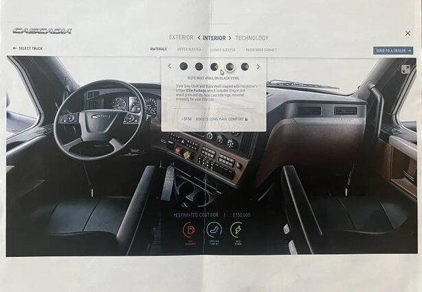
This was the existing version before I joined the project (UX credit to Jason Reyna). In this iteration, exploring and configuring the truck were divided into two views within the same interface, accessible via tabs at the top. In the 'Explore' mode, users could learn about different features of the truck and switch between viewing the exterior and interior. These features were also present in the 'Build' mode, but arranged differently in a nested view.

Take-aways
The separation between the visual explore features and non-visual configure features sections resulted in some dissonance during selections, given what was a visual experience became text-only with segmented switches during configuration.
Additionally, when users selected incompatible options, certain choices would change or become disabled without any notification or explanation. For example, the Aero X package included both roof and chassis fairings. If the chassis fairings were modified, the Aero package would also change, despite these appearing as three unique selections.
Overall, the evident complexity of the task surfaced in this design, proving configuring a semi-truck in an online experience was not a simple task. However, the design offered a highly effective exploration experience that allowed the user to rotate the truck and click into certain areas of the car for more information with full screen slides and video.
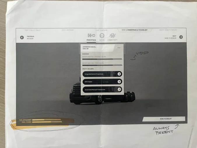
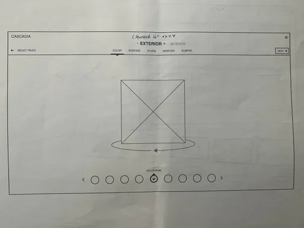
This next iteration focused on integrating interactive learning material into the builder itself, and favoring a landing page about the truck over a dedicated explore mode. Considering a mobile experience, the sidebar configuration columns were moved to a row underneath the original tree structure. The exploration here is all on paper copies that were used for discussions. I have put them in order to show the evolution of my thinking through the experience.
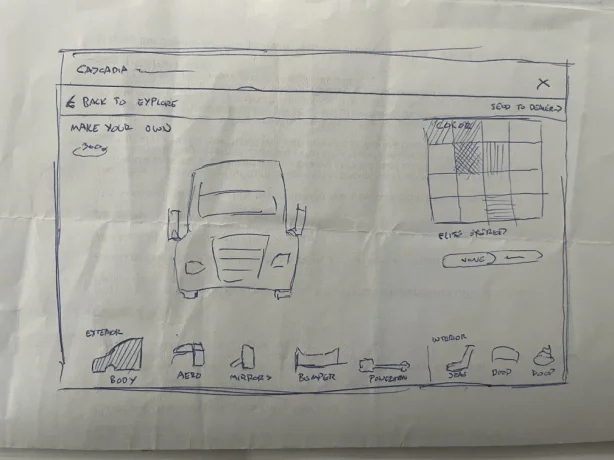
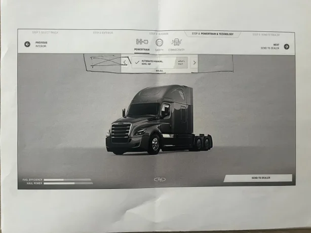
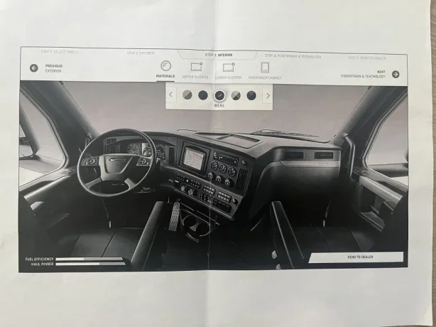
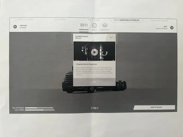
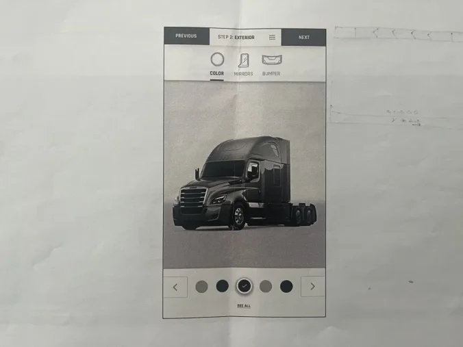
Given there was so much text in the first iteration, I swapped many text elements for icons representing each piece of the car you could customize in a scrolling horizontal list.
Next, this was moved to top-down tree navigation, where the sidebar has been removed, and selections are progressively and visually disclosed as opposed to a vertical list of options. Each option was given an associative visual, and a way to view an explanation for the choice made.
The next evolution was changing the exploratory navigation to a more wizard-like approach with steps to follow, with a higher emphasis on visuals elements. It retained the bottom selection and explainer fields.
Take-aways
This iteration was nearly as complex as the first iteration, and didn’t solve the issue of incompatible selections. Configuring powertrain options offered no visual feedback, since you couldn’t see anything changing underneath the hood. There were also too many navigation elements on the screen, which was overwhelming.
There are still a few problems to address:
1. Navigation is overwhelming
2. Objectives for the user are unclear
3. Incompatibilities are still difficult to communicate
4. Lack of visual feedback when configuring technology
I’d like to start by examining what the necessary and unnecessary elements were from the second iteration, and ask some questions about how we can make some changes.
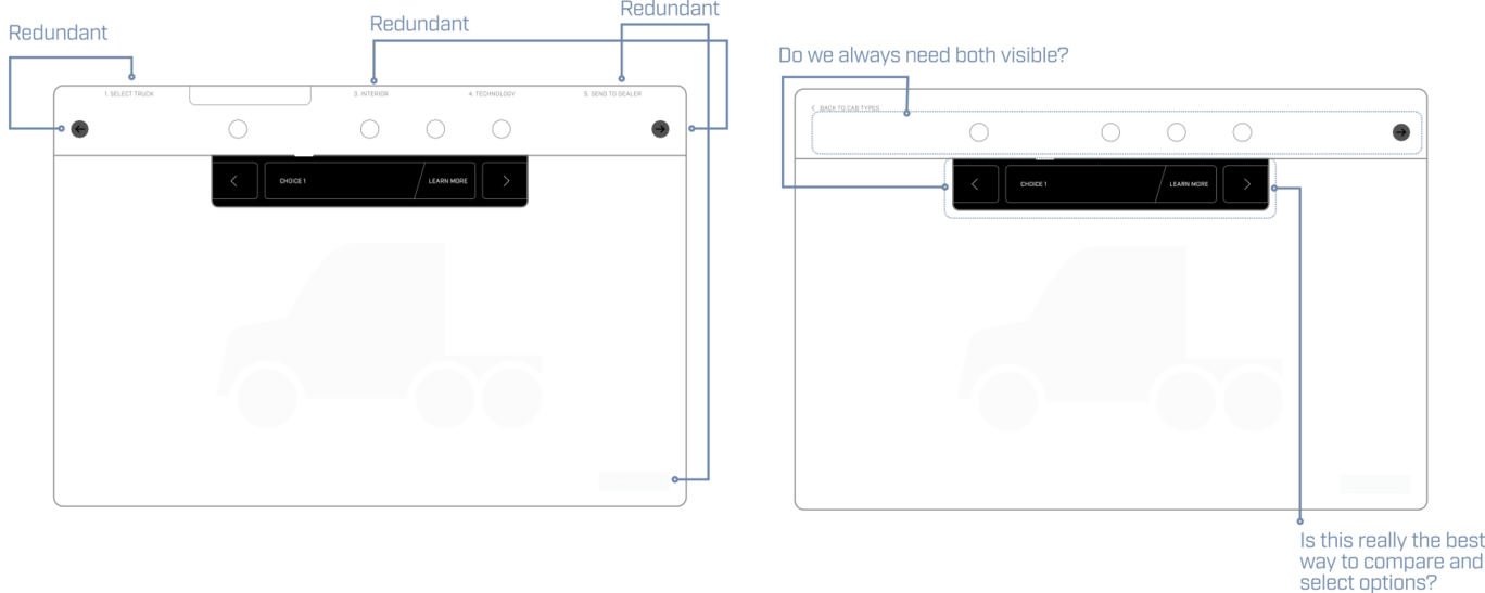
After removing some redundancies and answering some questions, adjustments provide some more clarity.
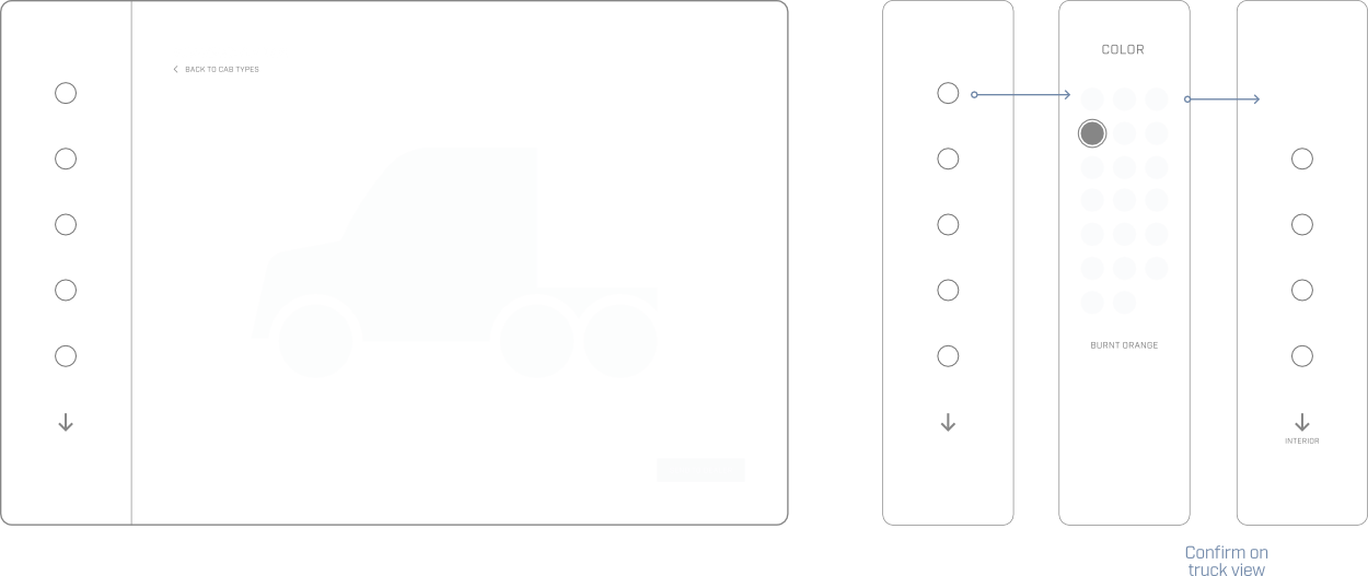
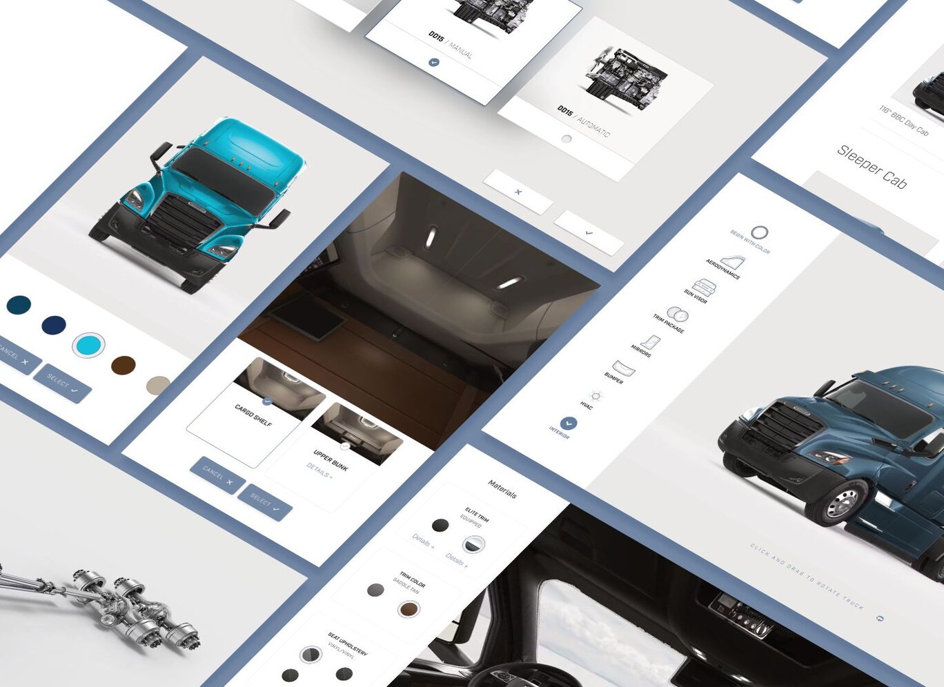
Rather than always showing the current orientation, option, and selection, we can disclose each part in a sequence: The sidebar dynamically shifts between displaying options and their nested selections. Once a selection is confirmed, the sidebar reverts to the options selector, marking completed items with a checkmark to incentivize users to explore each section.
The order and visibility of options are determined by their influence within the options matrix. If new options become available based on prior selections, they will appear in the sidebar for further exploration.
For example, if "None" is chosen under "Aerodynamics," confirming this selection will then animate and reveal "Chassis Fairings" in the sidebar as a new option to complete. Changing the "Aerodynamics" back from “None” will remove "Chassis Fairings" as an item to be completed from the list, given chassis fairings are a type of aerodynamic outfitting. Visual relationships between these incompatibilities are further clarified by adding a card visual for each selection.
Incompatibilities in this way are communicated as a non-destructive selection, and are treated as exploratory. They are most easily communicated visually and with motion. As for communicating incompatibilities with technology, that is where things become a bit trickier.
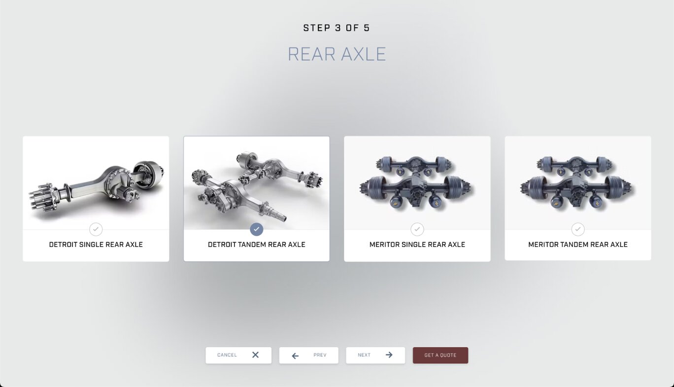
Similar to the interior and exterior compatibility options, options that influenced the most incompatibilities were given priority. However, instead of hiding and showing options in the sidebar, the user was brought through an interactive wizard experience inside the truck view. This provided visual feedback for otherwise invisible changes and allowed for a more comfortable experience making destructive changes.
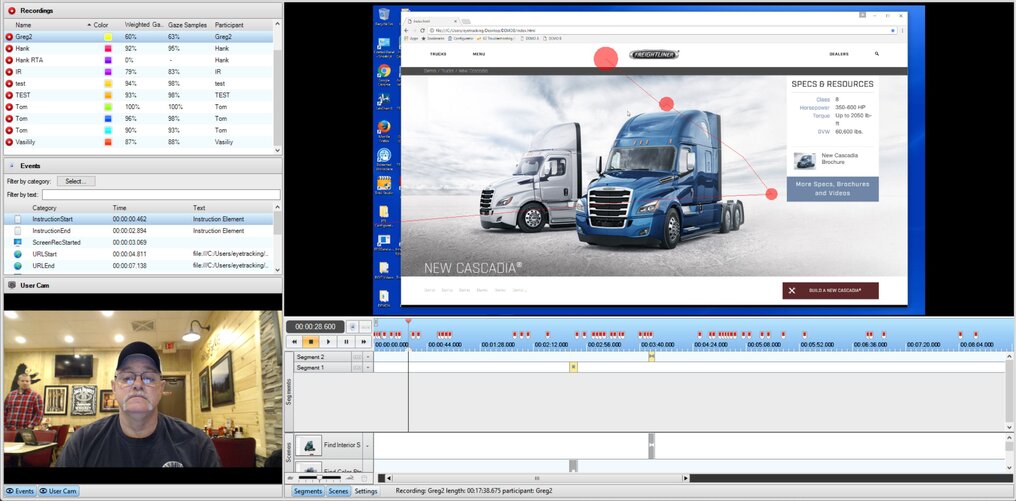
In-person usability studies were conducted with the target audience (truck drivers, owner-operators, and corporate buyers) using eye-tracking along with contextual interviews.
Against other iterations, including a strict wizard approach directed by the client, my final iteration proved overwhelmingly successful.
Aside from designing the experience, I also designed the UI, their components and icons, and built high-fidelity prototypes with HTML, CSS, and JS (jQuery at the time) that were prepared for testing, both the client’s desired ideas and my own iteration.
Increase in qualified leads
Upon completing a configuration, contact information was sent to the nearest dealership. Dealerships experienced such a significant surge in qualified leads that their main challenge became managing this influx—a much better problem to have. While exact sales data cannot be disclosed, truck sales also benefitted from a dramatic boost.
