Latitude
How my redesign of the leading procedurally-generated RPG led to faster feature development, boosted DAU, and doubled revenue.
AI Dungeon is the leading procedurally-generated text-based RPG, initially attracting tech enthusiasts and niche gamers. Rapid developer expansion led to disjointed features, a confusing experience, and significant tech and design debt, making it difficult to recover from a two-year decline in revenue.
Boost revenue by enabling faster feature addition and iteration through reusable UX patterns and a design system.
I created AI Dungeon’s design system, adapted from our Voyage project, using Tamagui for its web compiler and constraint enforcement. I developed 100% of the system's implementation and did about 50% of the platform rewrite in React and React Native.
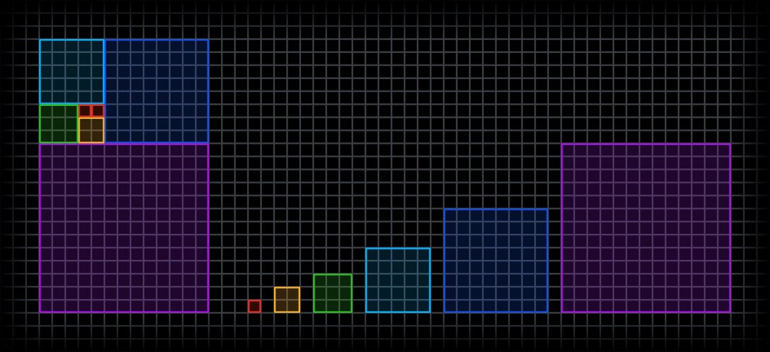
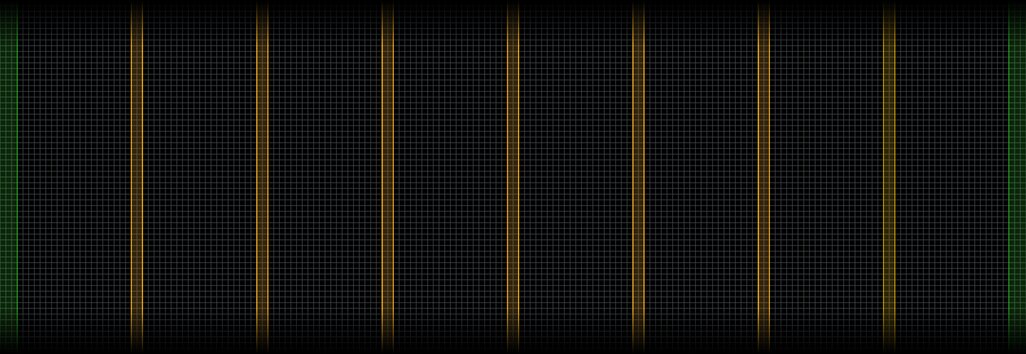
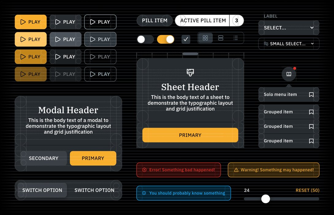
Like cells make up organisms in their own grid, all design, naturally, should follow its own system of cells. Design followed an 8px grid, 8px baseline, and 8-column layout on a 1440px width. Sizes were based on Fibonacci numbers multiplied by a grid unit. Breakpoints were relative to the columns.
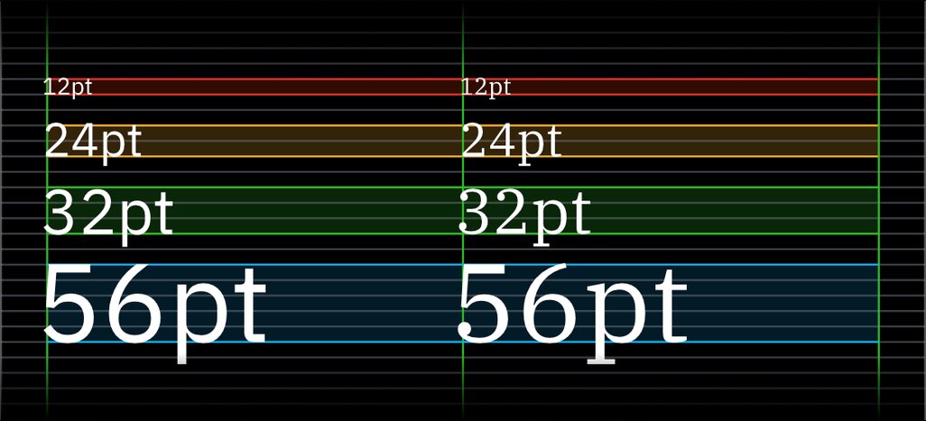
I chose IBM Plex Sans and Plex Serif for their blend of human and machine elements. Serifs were for headers and gameplay text to evoke a book-like feel. Type sizes and baselines aligned with the grid.

I designed an icon set to match AI Dungeon’s overall style, aligning with IBM Plex’s features: optical characteristics, baselines, sharp inner bowls, and stroke widths.



Inspired by a yellow flame in a dark dungeon, colors were divided into five categories and graduated into 10 values. A dark transparency set re-created the black opaque set against a black background.
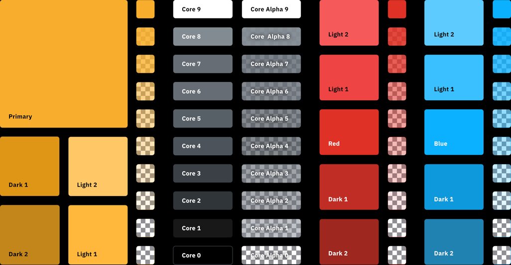
Here’s a sample of some atomic elements used in the design system.
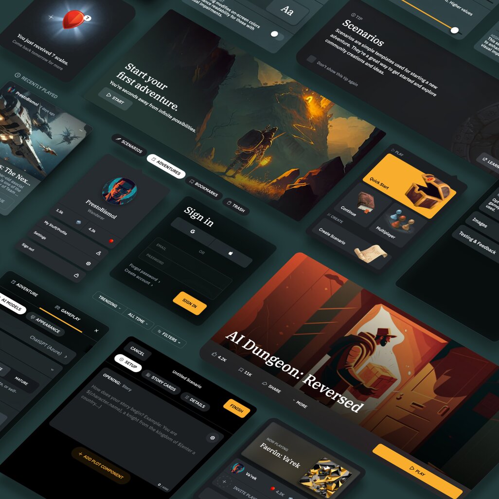
I built a theme engine for AI Dungeon’s game screen, changing the UI based on a spritesheet.
The UX of the entire app received a major overhaul, much of which has been imitated by other AI apps. Listing each change here is challenging, but some main areas stand out for me.
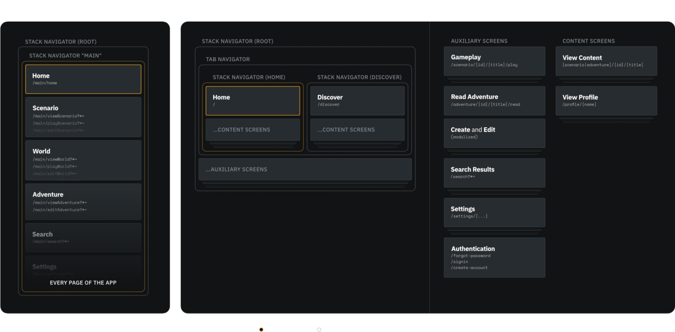
Original navigation was a drawer stack, making paths without hierarchy difficult to navigate. I switched to tab and nested stacked navigation for mobile and web, with nested URLs and appropriate auxiliary navigation.
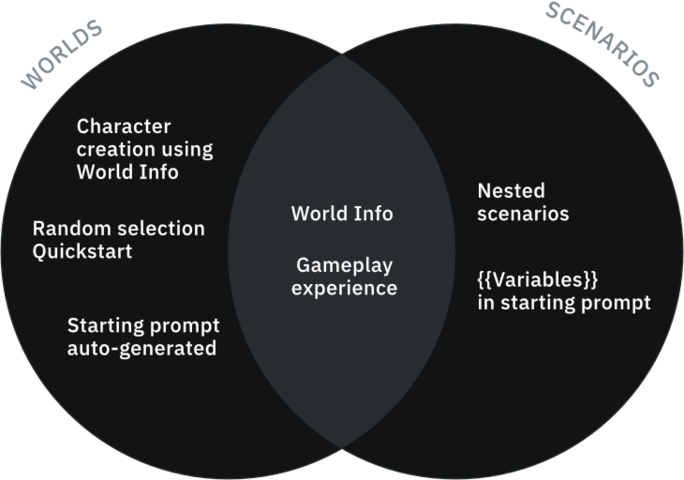
The game originally had “Worlds” and “Scenarios,” both using World Info but differing in creation. These content types and creation flows were merged for simplicity, hinging on dependencies further up.

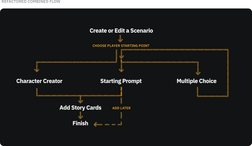
Here’s an example of a community-created scenario called “Pathfinder” that demonstrates the result of the creation flow. It starts with multiple-choice selections and ends with character creation.
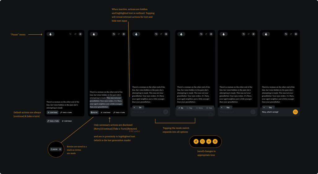
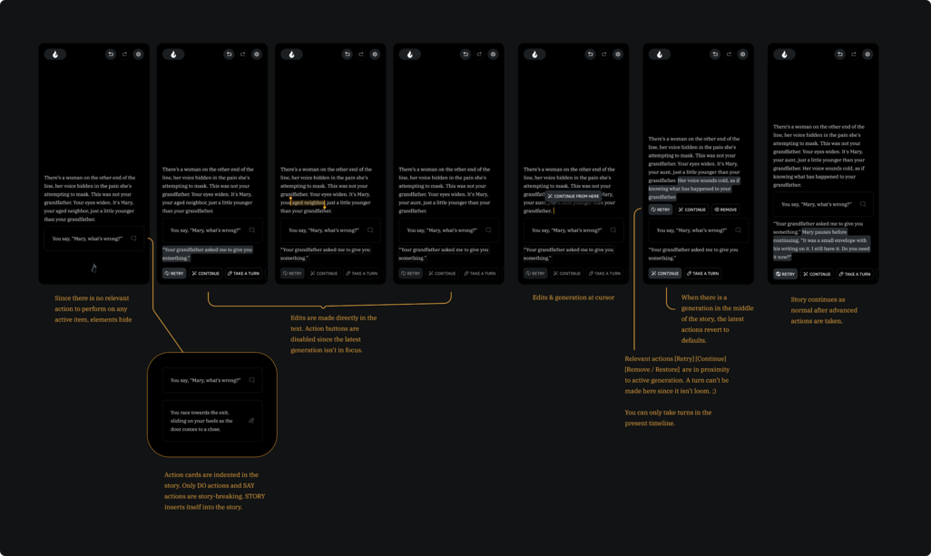
Gameplay was revamped for clarity and discoverability. Controls were introduced dynamically, reducing choices and enhancing command discovery. User testing showed improved control use, especially for “Continue” and input mode switching.
Additional UX Work
Other work of mine included overhauling content screens, browsing screens, content cards, global settings, menus, notifications, rewards, in-game settings, sidebar, comments, multiplayer, search, AI instructions, and more.
Testing
Testing included live video interviews with new users and feedback from the Alpha Tester Program.
Results
Post-launch, freed from design debt, the team delivered quality features faster than ever.
Increase in revenue
Increase in DAU